
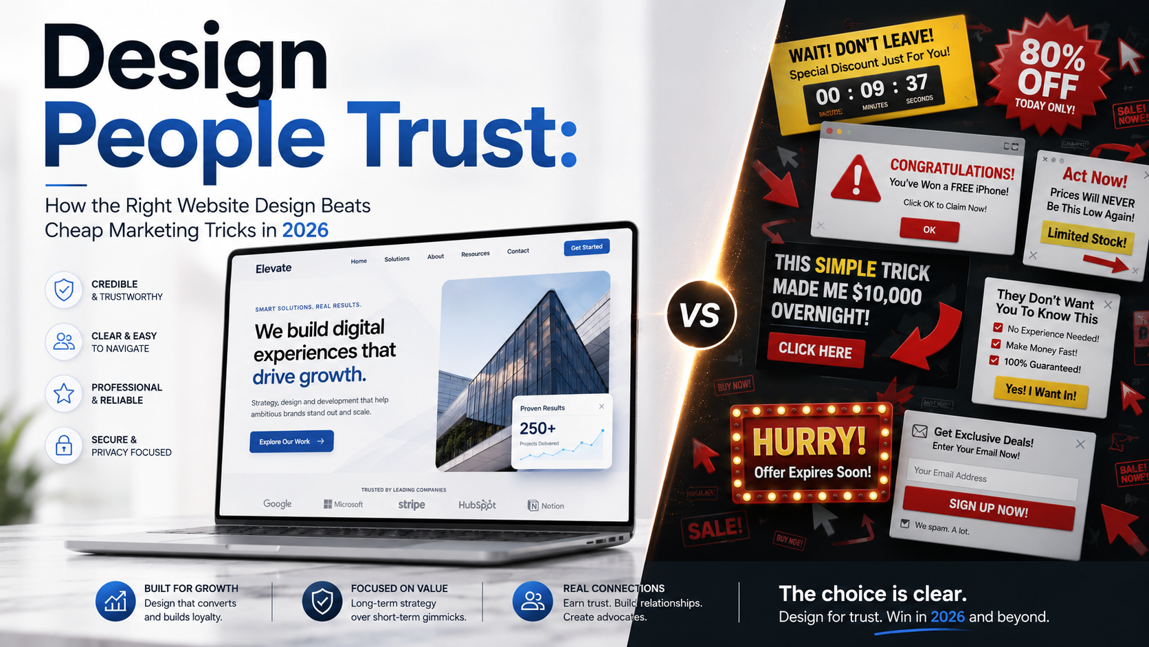
A polished website can earn attention in seconds. Trust takes longer. Before visitors book a call, request a quote, or enter a credit card number, they want to know: Is this business real? Will it do what it says? What happens after I click? Can I leave without a fight?
The strongest web design in 2026 does not rely on decorative badges. It reduces uncertainty through clear language, credible evidence, transparent terms, accessible interactions, reliable performance, and honest choices. Fake urgency and hidden conditions may force a click, but they make the business harder to trust.
For a company comparing a Boston-based digital marketing agency, the useful question is not who can add the loudest animation. Digital Style Designs approaches professional web design as an architecture of trust: clear hierarchy, verifiable proof, transparent terms, accessible interactions, and a predictable next step.
What Trust-Based Design Is – and What It Cannot Promise
Trust-based design makes a website’s claims, choices, and consequences easy to understand and verify. It shows who is behind the business, what is offered, what it costs, why information is collected, and what will happen next.
A useful working model is clarity + evidence + control + consistency – friction – deception. It is not a scientific score; it is a decision tool. If the hero promises an outcome, the page should explain the process. If a testimonial cites a result, the reader should see who achieved it and under what conditions. A trust signal works only when it answers a real concern at the moment that concern appears.
In a 2002 Stanford study of 2,684 people, comments about visual design appeared in 46.1% of website credibility assessments. The study is too old to predict modern conversion rates, but its lesson remains useful: visible design cues shape first impressions. They cannot rescue a false claim, weak offer, or unreliable service.
Why Cheap Marketing Tricks Lose in 2026
Dark patterns exploit the gap between noticing and understanding: a timer resets, a box quietly adds a subscription, the decline link nearly disappears, or fees arrive at checkout. Such tactics may improve one metric while creating lower-quality leads, refunds, cancellations, complaints, and negative reviews. This is trust debt: a short-term action that creates a larger downstream cost.
A 2024 international review coordinated by the Federal Trade Commission examined 642 subscription websites and apps. Nearly 76% appeared to use at least one possible dark pattern, and nearly 67% appeared to use more than one. Those figures describe the reviewed sample, not the entire web, but they show how widespread manipulative choice architecture became.
In 2026, generic polish is also easier to produce with templates and AI. That makes specific details more persuasive: real names, dates, constraints, original examples, documented processes, and policies written for humans. Cheap tricks create trust debt; verifiable information reduces it.
Honest Signal or Cheap Trick?
The same conversion tool can be responsible or manipulative. The test is whether it helps a person make an informed choice or makes one option artificially hard to understand or refuse.
| Pattern | Trust-building version | Cheap-trick version | Check |
|---|---|---|---|
| Urgency | A real deadline with a reason | A timer that resets | Can the deadline be verified? |
| Social proof | Named proof with context | Anonymous or unsupported praise | Can the claim be evaluated? |
| Pricing | Total cost and terms up front | Fees or renewals revealed late | Can the buyer predict the charge? |
| Lead form | Necessary fields with explanations | Excessive data capture | Does every field earn its place? |
| Choice | Clear accept and decline options | A disguised refusal | Is saying no reasonably easy? |
| Security | Real protection and relevant reassurance | Decorative seals with vague claims | Is the claim technically true? |
If a customer would describe the interaction with “I did not notice,” “I could not find,” or “I thought I had to,” the experience probably needs redesigning.
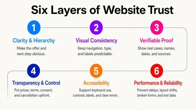
Six Layers of Website Design That Build Trust
Website trust is cumulative: no single badge or design choice can create it alone. The six layers below show how clarity, consistency, proof, control, accessibility, and reliability work together.
1. Clarity and hierarchy
Visitors should quickly identify the offer, audience, benefit, and next step. Specific language beats slogans: “Payroll support for restaurants with 20-100 employees” says more than “Solutions that move business forward.” Arrange the page in decision order: relevance, process, proof, terms, then action. Buttons should name the action, such as “See pricing” or “Book a 20-minute consultation.” Navigation should use the customer’s vocabulary, not internal department names.
2. Visual consistency
Stable navigation, repeated spacing, readable typography, and consistent terminology suggest care. Mismatched icons, competing button colors, and outdated details suggest neglect. Use contrast to explain structure, not to manufacture pressure. When every message flashes or moves, emphasis loses meaning and the page feels less controlled.
3. Verifiable proof
A useful case study names the problem, starting point, intervention, timeframe, result, and limitations. Testimonials should identify the person or company when permission allows. Certifications need an issuer; awards need a year and category. Match the depth of proof to the risk of the decision: a major B2B purchase requires more evidence than a low-cost product.
4. Transparency and control
Show billing periods, fees, renewals, delivery terms, and cancellation rules before commitment. Separate required consent from optional marketing. Explain sensitive form fields where they appear, and make editing, declining, or leaving proportionately easy. Control is not friction; it is evidence that the relationship remains voluntary.
5. Accessibility
Keyboard access, visible focus, meaningful labels, sufficient contrast, text alternatives, and clear errors make a site dependable for more people. WCAG 2.2 became ISO/IEC 40500:2025. Compliance is not a one-time badge, but accessibility is a practical signal of product quality and respect. It also prevents users from mistaking an interface failure for a business failure.
6. Performance and reliability
Slow responses, layout shifts, lost form data, and broken links make a business feel unstable. Core Web Vitals assess loading, responsiveness, and visual stability through LCP, INP, and CLS. Field data matters because it reflects real devices and connections. Also test forms, recovery paths, contact details, mobile layouts, and confirmation messages.
Where Trust Signals Belong
Put reassurance near the question it answers instead of hiding every credential in a footer logo strip.
- Home: State who you serve, what you do, where you operate, and the primary next step. Use concise proof that supports the main promise.
- Service or product: Explain scope, process, timing, pricing logic, exclusions, and relevant proof. Answer common objections before the call to action.
- About: Show real people, roles, experience, credentials, and accountability. Use current photographs when possible.
- Case studies: Add industry and challenge context, then separate measured results from estimates and client opinions.
- Forms: Ask only for necessary data; explain response time, data use, what follows, and provide an alternate contact route.
- Checkout: Keep total cost, delivery, returns, support, and security reassurance visible near payment fields.
In Baymard’s 2025 study of 1,026 U.S. online shoppers, 19% said they had recently abandoned an order because they did not trust the site with card information. This applies to e-commerce checkout, not every website, but it shows why reassurance must appear when risk becomes personal.
Trust After the AI Content Boom
AI lowered the cost of acceptable copy, images, code, and layouts. It did not lower the cost of credibility. Generic fluency is weak evidence of expertise, so show accountability: name authors or reviewers, date important updates, explain methods, include original demonstrations or data, and acknowledge limitations.
Google recommends helpful, reliable, people-first content and encourages clarity about who created it, how, and why. E-E-A-T is a useful quality framework, not a single standalone ranking factor. The practical SEO lesson is to publish pages that deserve to be used and cited, not pages designed mainly to simulate authority.
Specificity is the new polish. A real process diagram, annotated example, original photograph, or candid explanation of tradeoffs can build more website credibility than another cinematic hero animation or a generic “verified” seal.
How to Measure Trust, Not Just Clicks
Trust is not one analytics event. Measure it through comprehension, confidence, and downstream quality.
- Can first-time visitors explain the offer, audience, and next step?
- Where do form errors and abandonment occur, and are completed leads qualified?
- Do changes affect refunds, cancellations, complaints, chargebacks, or support contacts?
- Are important journeys reliable across mobile, keyboard use, and slower connections?
Segment results by device, traffic source, and new versus returning users without creating invasive profiles. Test with guardrails: more signups are not a win if cancellations, low-quality leads, or complaints also rise. Define success before the test and observe the consequence that matters, not just the immediate click. Pair analytics with questions such as “What almost stopped you?” and review recurring concerns in sales calls or support logs. Customer language often reveals uncertainty before a dashboard does.
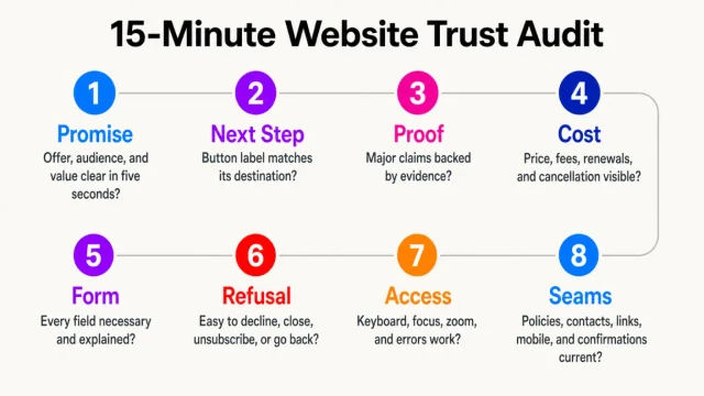
A 15-Minute Website Trust Audit
Open one high-value page in a private browser window and use a phone-sized view. Then check:
- Promise: Can you state the offer, audience, and value in five seconds?
- Next step: Does the main button lead exactly where its label promises?
- Proof: Can each major claim be supported by a source, example, method, or qualifier?
- Cost: Are price, fees, renewals, delivery, cancellation, and exclusions easy to find?
- Form: Is every field necessary, with sensitive requests explained?
- Refusal: Can you decline cookies, close a pop-up, unsubscribe, or go back easily?
- Access: Can you navigate by keyboard, see focus, zoom, and understand errors?
- Seams: Are policies, contact details, links, mobile layout, and confirmations current?
Prioritize by customer risk and frequency, not visual embarrassment. A confusing renewal term matters more than a slightly uneven icon.
What to Fix First on a Limited Budget
Start where visitors give up money, data, time, or control: inaccurate claims, hidden conditions, surprise costs, broken forms, inaccessible core actions, security problems, and unclear cancellation. Then improve the value proposition, navigation, calls to action, pricing language, response expectations, and error messages.
Next, strengthen clarity and evidence: improve the value proposition, navigation, calls to action, pricing language, response expectations, case studies, team information, and policies. Many valuable fixes are inexpensive: remove an unnecessary field, add a real person’s name, explain what happens after submission, put the billing period beside the price, or replace a false countdown with an honest deadline. The lasting advantage is coherence across the ad, page, form, sale, checkout, and follow-up. When every touchpoint behaves as expected, persuasion needs less pressure.
Frequently Asked Questions
These common questions summarize the practical decisions behind trustworthy website design. Use the answers as a quick reference when reviewing your own pages.
What makes a website look trustworthy?
Clear language, consistent hierarchy, current business information, verifiable proof, transparent terms, accessible interactions, reliable performance, and predictable calls to action. Appearance creates the first impression; credibility grows when claims and consequences can be checked.
Do trust badges increase conversions?
They can when they are authentic, relevant, recognizable, and placed near the concern they address. A payment mark beside card fields may reassure shoppers; an unrelated footer seal may do nothing. A badge cannot compensate for hidden fees, weak security, unfamiliar checkout behavior, or unclear policies.
What are dark patterns?
They are interface choices that pressure, confuse, or obstruct people, such as false urgency, preselected consent, disguised refusal, difficult cancellation, and hidden recurring charges.
How can a small business build website credibility?
Start with a specific offer, real contact and service-area details, named people, a clear process, transparent pricing logic, relevant reviews, and a dependable mobile inquiry path. Fix broken forms and outdated information before buying decorative badges or complex animation.
Is accessibility part of trust-based design?
Yes. Keyboard support, contrast, labels, focus states, alternative text, and clear error recovery make important actions more dependable and show consideration for a broader audience.
How quickly can trust improve?
Clearer buttons, fewer fields, current details, and visible billing terms can be fixed in hours. Accessibility, performance, policy, and journey improvements may take weeks. Prioritize by customer risk and measure downstream outcomes.